(Guest writer Ty Lowery has assembled a personal list of favorite metal album covers for 2014 to date, divided into two parts. Please feel free to add your own favorites in the Comments.)
Sometime last year, I had planned to showcase some of my favorite album covers. However, as you might imagine, that didn’t happen. So, a bit over halfway through 2014 already, I’ve decided to give it a go again so I don’t have to worry with trying to find everything last minute and become overwhelmed at year-end. I’ve been looking back at some of my favorite album covers, as well as looking at random covers here and there, and I must say, I’ve found a lot more than I expected- so many that I think it’s be best to break this up into a couple of posts.
I’ve actually happened upon some really cool bands this way, too, which isn’t out of the ordinary but worth noting nonetheless. Had it not been for their album art, I might never have found some of the following bands, one of which I simply can’t get enough of. However, to be clear, I’ve done this exercise for the sole purpose of rounding up the nicest looking album art, according to my own tastes. There are a couple of bands in here whose music I can’t stand, and a couple more I’d never heard of before. So to avoid any confusion, I am not necessarily recommending all of the albums featured below. They all just chose wisely for their album art.
Since I began working on this article, I noticed something peculiar: A good number of the album covers correlated in one sense or another with the music on the album. To make sure that I wasn’t just imagining this, I asked my wife (who’s not very big on metal music as a whole) and a friend of mine (who is) to look at the album art and give me their impressions. Some of them were spot-on, others not so much. Here’s what we came up with for the first nine. (Another note, these are in no particular order. They are just listed as I came upon them.)
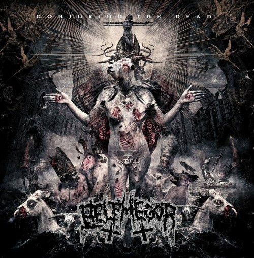
Belphegor – Conjuring the Dead
This might be one of the best “photo realistic” album covers I’ve seen so far this year. It’s got the dark, gritty feel washing over it in shoals. The symbolism on the cover speaks of blasphemy, a great deal of death, and more than a smidge of Satanic interplay. When my wife Heather saw it, she immediately guessed that it was death metal, which is a good part of the album, so I’ll give it to her. My friend Adam said the same thing: “This had better be death metal.” Heather also hit the nail on the head about the dark/demonic themes that run throughout many of the songs. That’s a point for the correlation theory, although an easy one.
The artwork was created by Greek artist Seth Siro Anton (of Septicflesh), who also created the cover of Pestapokalypse IV in 2006.
http://www.sethsiroanton.com/gallery.html
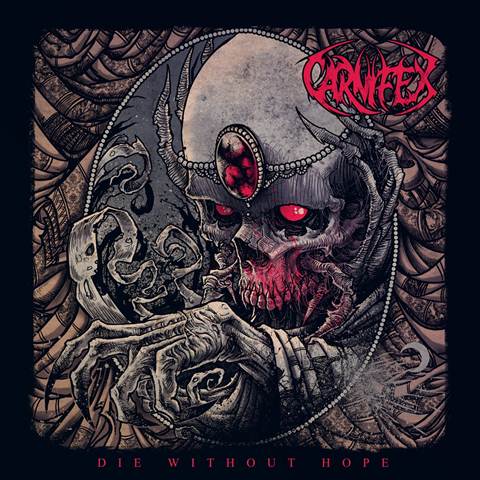
Carnifex – Die Without Hope
“Shit is creepy.” Those were the exact words that came from my wife’s mouth when I showed her the cover for Die Without Hope. She guessed black metal on this one, which is a good ways off, but she got the content of the album pretty solid. Dark themes, which was made evident to her by the title of the album. Overall, the artwork is very clean. The lines are clear, and the red work plays well. Some albums have a color theme, and red seems to match well enough with the music. Adam, having known Carnifex prior to this exercise, hit it all straight-away.
Artwork by Godmachine
http://godmachinedesigns.blogspot.com
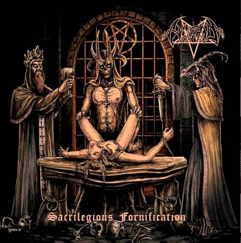
Horrid – Sacrilegious Fornication
So, after Heather reacted to the Carnifex album, I showed her this cutesy little piece here. If only words could describe her expression. She nailed this one pretty much on the head: “Very evil, probably death metal,” were her thoughts, which are correct. Adam called black metal. Honestly, so did I, so naturally we were both wrong. “Clearly about ritual worship and Satanism.” I will say, it’s not exactly divining the future from tea leaves, but the purpose is served. The ritualism is evident in the music, if nowhere else, then at least in “Blood on Satan’s Claw”. I enjoyed the artwork here due to its grittiness, and it has good line work as well. It reminds me of DnD drawings from way back in the day, if all the artists were way into the occult.
Artwork by Christophe Thorncross Moyen
http://www.chrismoyen.com/accueil.htm
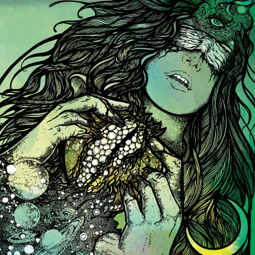
Dwellers – Pagan Fruit
This art is just beautiful. I would have this framed in my house. It’s very reminiscent of the art of John Dyer Baizley (of Baroness fame). Had I not done the research, I would have given him credit. Instead, that distinction goes to Adrian Brouchy of Coven Illustración. Heather got this one correct as well. “Heavy Metal, with lighter content. Maybe sexual.” Adam was right along those lines in regard to content, but he guessed metalcore as a genre. While I didn’t listen to the entire album before starting this write-up, I can say this: The chillness of the music is at times romantic, if not downright sexy. As a side note, I had never heard of these guys before, and the artwork drew me to them. That’s definitely a good thing. This is excellent driving or hiking music.
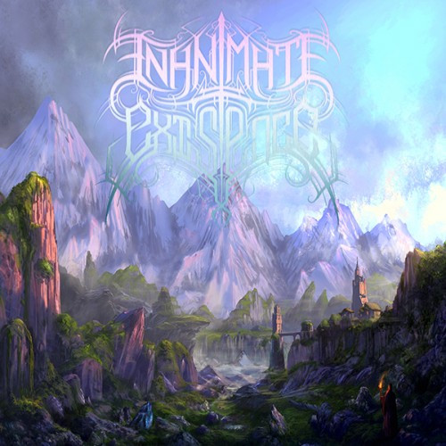
Inanimate Existence – A Neverending Cycle of Atonement
“Typical heavy metal.” That’s a swing and a miss for Heather. Adam, when prompted to only look at the artwork and not the logo, suggested the album was pure folk metal. Interesting idea, but wrong nonetheless. Another correlation I’ve noticed with genres and artwork: There’s usually a great deal of color in the artwork of technically advanced bands. That’s to say it’s a good assumption that there will be a good bit of weedly-weedly if the artwork displays a vibrant color scheme. This is no exception, of course, though I’m certain there are plenty out there. Keep in mind, I’m writing this up as I go along. I mean, it’s not a rainbow or anything, but the vibrancy of the color is more dominant than any other first impression. One thing my wife did get right, though: The artwork doesn’t convey much in regard to content. It’s just nice to look at.
Artwork by Guang Yang
https://www.facebook.com/OYangGuang
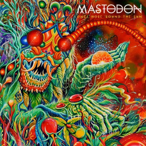
Mastodon – Once More Around the Sun
This is an incredibly vibrant piece of art. The vinyl foldout is even more impressive. I contemplated buying this vinyl just to put it up on my wall. Heather knew this band, so she guessed the genre based on that, but she also said the art didn’t tie in with anything thematically, which is pretty much correct and very sad. Adam said that if he didn’t know any better, he would imagine this as cover art for a Chinese metal band. I miss Mastodon’s concept albums. Moving along…
Artwork by a man known only as Skinner
http://www.theartofskinner.com/art/#/all/2014
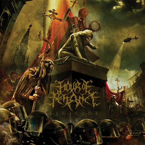
Hour of Pennance – Regicide
“Black metal. Dark content, lots of death. Genocide as a topic. Religious undertones.” This was pretty much the answer from both, with subtle variations. All of it pulled directly from the cover art. A number of bands do that, which is fine, but this album is probably one of the most overt examples I’ve seen this year, if not ever. The art is pretty neat, with a lot of detail strewn about. This artwork does a really good job of providing a window into to the concept of the album. A story could be told from this album, easily a couple thousand words long. Never mind that it’s a little busy. They’re not exactly black metal, but that’s alright. Good call on the content.
Artwork by Gyula Havancsák
http://hjules.com/#gallery
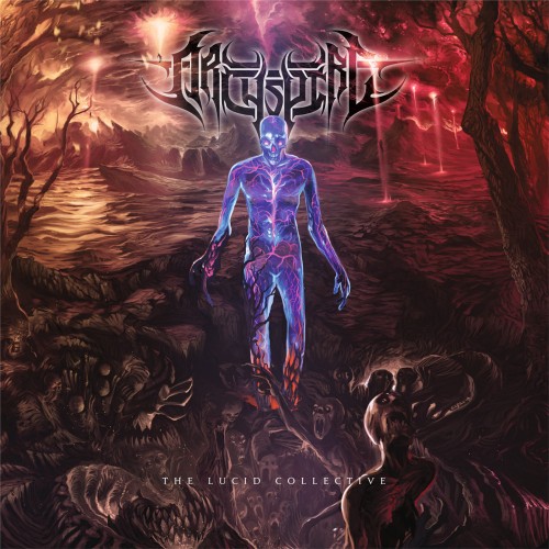
Archspire – The Lucid Collective
Holy shit. Let me just say, I am so glad I decided to do this. Otherwise, I might never have found this band. These guys have been playing almost nonstop since I found them. Going back to what I said about color and correlation, Archspire’s artwork is on the edge of that. The dark tones of red feel like the blood from a vanquished army washing over the alien life form that has come down to usher us into a new era of time. I say this because there are places where I can hear Rings of Saturn riffs being played (mind you, they’re much more cohesive), but that ties back in to their self proclaimed alien-core nonsense. Archspire seem to be swooping in and claiming titles as the prodigious champions of this made-up genre. Needless to say, Heather’s assumption of death metal was right on the head. Adam guessed straight-up metal, with context revolving around everyone dying…perhaps a global genocide?
(According to this interview, the background of the artwork represents the song “Fathom Infinite Depth,” while the foreground shows certain details from the song “Lucid Collective Somnambulation”.)
Artwork by Ken Sarafin
http://www.sarafinconcepts.com
Enabler – La Fin Absolue Du Monde
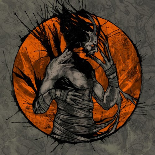
I’ll be honest. I know very little about this band. Heather guessed death metal, which is wrong, I guess? Adam guessed Deathcore, which was a little closer. Their Bandcamp says Hardcore, which is up for you all to decide. I rarely listen to hardcore. Either way, the artwork is very nice. I love the orange backdrop. It’s also not overly crowded, like a number of the albums I’ve showcased today. One thing I did find interesting, though: The first song I listened to, “New Life”, felt as if it were being ripped from itself, if that makes any sense. Either way, that matches the artwork pretty closely, which was cool.
Artwork by Chris Smith at Gray Aria Design.
********
Alright, so taking a look at my assistants’ guesses, Heather got 5 out of the 9 and, strangely enough, my friend who listens to metal regularly only got 4 out of the 9 right. That could be interpreted as proof that my whole theory is crap, and I’m ok with that. I still believe there are some valid ties between the album art and the context of the music, but that’s getting away from the point here, which is this: Metal music is often accompanied by a great deal of excellent artwork.
Since we’re only halfway through the year and I’ve found over 15 excellent pieces of art so far, this is turning out to be a great year for music AND art. Stay tuned for the rest of my list…

No Cormorant? No Twilight’s Embrace (shameless plug there)?
Replace that IE art with Cormorant and we have ourselves a deal!
Sorry man, I’m not a fan of the fuzziness. It’s all about the clean lines.
Misery Index then.
And not just because I know the artist.
Well look at you. That’s awesome. I really like his art. Does he do any tattoo work?
I don’t think so i’m afraid.
https://scontent-b-sea.xx.fbcdn.net/hphotos-xpa1/t1.0-9/10292501_10152395638502090_8828644238453369063_n.jpg
I like this version of Archspire’s cover art better.
Oh man, I haven’t seen that one before. That’s pretty awesome.
I really dislike the Hour of Penance cover. It seems too busy, the composition is weird, and overall a little cheesy (some people would say the same about the music). Like the Carnifex art, the Hour of Penance one puts off more of an evil vibe than I get from the music. At least the art apparently matches the theme in Regicide, but the video they put out for the “single” perfectly displays what I mean by cheesy. It’s like the masters of “stringing together random evil words” up there, Belphegor. The music is alright, but the themes seem to lack depth and inspiration. I would be fine with that if the music was exceptionally mind-blowing, emotional, or fun… But all i get from it is “meh”.
I don’t mean to be all negative, but when you have rad (or at the very least, interesting) artwork and the music doesn’t seem to match, it’s almost even more of a letdown.
No, I can agree, to some extent. Death metal isn’t exactly a fertile ground for diverse subject matter. There are a good number that go outside of the regular tropes in regards to themes, but there’s easily twice as many that’s content singing about death and corruption. It can get a little tiring.
I like Regicide and it’s because it’s so busy. There’s a lot going on on the cover, and that can also be said about the music itself. Call it busy or not, there’s no denying there’s a metric shit ton of riffs flying around everywhere. Sometime you just want to be overwhelmed with it all, if that makes any sense.
Yeah i know a bit about wanting gthat feeling, i have almost all of Origin’s and Ion Dissonance’s albums. Those two bands (among some of my other favorites) definitely have the “more is better” approach down. I juat never got way into HoP, and that particular cover looks like a mess. I’ve seen far wore, but also way better.
I personally really love the cover of Nux Vomica’s new album – I was drawn in by it, having never heard the band before, and now it might be my album of the year.
http://nuxvomicaband.bandcamp.com/album/nux-vomica
Whoa, that’s some pretty awesome art. Listening to Sanity is for the Passive now.
The whole album is fantastic, but I’m still partial to “Reeling”, the first track I heard.
Given how little I care for their music, I actually really like that Carnifex cover
I’m not a big fan of their music either. I love the really clean feel the art has to it, though. Check out the artist’s page. He’s got some really awesome art, overall.
the artwork for upcoming albums from Cannibal Corpse and Exodus are some of the best i’ve seen this so far this year
There’s a couple that I can’t wait to include. I think I’ll do another set in late November, then a “Best of” at the end of the year, is Islander’s willing.
I really liked the artwork for the new Fallujah, Septicflesh and Anathema. All three different styles but I thought they were really amazing.
The artworks listed in this post are pretty stellar too.
I’ll have to check out Anathema, if for no other reason than because Steven Wilson touched their last album. That man pisses excellence.
I think both the title and the cover image of the enabler album are a reference to the episode john carpenter did for the first season of masters of horror. Also, they must be really big carpenter fans to be referencing that particular, which I only watched once but distinctly remember finding rather underwhelming. Fortunately, the album is good.
Speaking of horror-referencing art, I really like the cover for the new cannabis corpse.
That’s really cool. I love when bands do stuff like that.
Interesting post. I agree how in metal – which boasts some awesome album art as a whole – it’s funny how different subgenres group together with different album art looks, and you get the point of feeling like you can look at the artwork and already know how it sounds….until someone pulls a bait and switch!
I also like the idea of asking people with no idea about metal… although I do wonder if the dominance of ‘death metal’ answers is simply because that’s probably the only genre of metal a lot of non-metalheads know about?
For my picks:
Septicflesh – Titan. Although I prefer some of the interior artwork to the cover, like this one: http://static.muzu.tv/media/images/002/240/174/0001/2240174-thb2.jpg
reminiscient of Leonardo Da Vinci’s work (http://www.universalleonardo.org/trail.php?trail=345&work=334)
Mechina – Xenon: I think it’s their best cover art yet: http://mechinamusic.bandcamp.com/album/xenon
And how could you not love Lorelei’s artwork: http://lorelei-nc.bandcamp.com/album/lore-of-lies
And I’m kind of cheating here – because the album isn’t out yet – but hopefully should be soon and In Dread Response will drop this awesome artwork on us: https://www.nocleansinging.com/wp-content/uploads/2013/05/In-Dread-Response-Heavenshore-banner.jpg
I’ve never heard of In Dread Response before, but that banner makes me really excited to listen to them. That looks epic. Lorelei’s art is pretty sweet looking, as well.
Auroch and Goatwhore have fantastic album covers this year. Wonderful line art.
Unaussprechlichen Kulten, Incantation, Diocletian, Serpentine Path, Oubliette and Necros Christos albums are great in the painted vein. (throw Lvcifyre in there too)
In terms of photos, Emptiness and YAITW kinda killed it with their covers.
Lastly, Domains may be my favorite cover of the year. Love the hues.
Love the YAITW cover. CD I got came with a poster of it, which naturally now hangs on my wall.
I friggin’ love artworks and people who recognize the importance of its role.
You should check out the new Inferi and the new Splattered. Two amazing pieces of art too!