(Andy Synn returns to his irregular series devoted to things that come in five’s, the focus of this one being metal album art.)
The phrase “never judge a book by its cover” was obviously uttered by someone who’d never found themselves stranded in a busy bookshop and frozen by indecision over which of the many, many options to spend their hard-earned cash on.
Of course while I agree with the sentiment in principle – style is no substitute for substance after all, and a shiny package is no guarantee of superior contents – the truth is that human beings are very visual creatures, and an eye-catching cover, one which hints at the themes and manifest delights contained within, can be the difference between finding a new reader and being consigned to the bottom of the bargain bin at the end of the month.
The same obviously applies when we’re talking about albums too. Yes, the move towards a primarily digital market has had an impact on the means and methodology behind how new albums are accessed and presented (though apparently physical sales have been rebounding quite a bit recently), but the importance of good album art still shouldn’t be understated.
I feel like bands need to remember that seeing the artwork will still be the first encounter many people have with their album, and so it needs to be as enticing, as intriguing, and as attention-grabbing as possible. It can be as clean or as gory, as complex or as simple, as they want it to be… but it needs to stand out, possibly now more than ever.
Truthfully it still galls me to see bands/artists whom I know to make good music half-arsing it when it comes to their album art. Surely if you’re going to put all that energy into the audio, then you want to put just as much effort into the visual side of things too? Or else why even bother?
Let me tell you, if I see one more lazily photoshopped collage of some shiny-skinned cyborg/steampunk woman in front of a generic “post-apocalyptic” wasteland or cityscape… well, there’s going to be trouble.
That being said, there’s obviously a lot of great art out there gracing the covers of some similarly great albums. In fact just this week one of our regular commenters remarked about how much good artwork was featured in my latest collection of reviews (and they were right too).
So, since I’ve been meaning to do a column like this for a while now, that comment felt like the perfect catalyst to finally put my non-existent money where my big mouth is, and pick out a handful of album covers which have made a serious impression on me over the years.
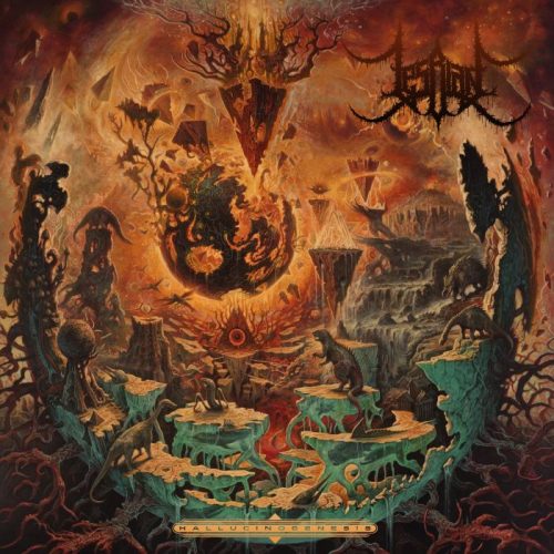
LESBIAN – HALLUCINOGENESIS
The first one which immediately sprang to mind, and which was immediately guaranteed a place here, was this majestic piece of OTT prog lunacy, courtesy of the legendary Dan Seagrave.
As a matter of fact, this whole column could easily have been filled with just Seagrave work (his pieces for Becoming The Archetype, Landmine Marathon, and Rivers of Nihil were all very much in contention), but since I made the decision to limit each artist to one entry and only one entry, this is just going to have to suffice.
Thankfully it’s one of his best pieces in my opinion, which is why it’s here. The colours and the composition, the abstract strangeness of it all, and the fact that it’s not instantly identifiable as a Seagrave piece (he does have a very recognisable style after all) just make it a near-perfect cover in my eyes.
https://lesbian.bandcamp.com/album/hallucinogenesis

DISMEMBER – MASSIVE KILLING CAPACITY
Kristian Wahlin, aka Necrolord, is another artist whose work could have filled this column several times over, which meant that slimming down the available options to a single entry was far from easy or simple, especially since I’m such a big fan of his work for Necrophobic, The Black Dahlia Murder, and In Mourning (to name but a few).
However, when push came to shove, it was this utterly ridiculous (and ridiculously good) piece of uber-metal iconography which won the day.
I mean, just look at it… part Warhammer 40K, part 2000AD, it’s a gigantic walking tank/mech with chainsaws for arms and cannons protruding from every orifice, emblazoned with the Dismember logo, striding across a field full of skulls and crushed bones. It’s simultaneously the most brutal and preposterous album cover in existence. And, really, what more could you ask for?
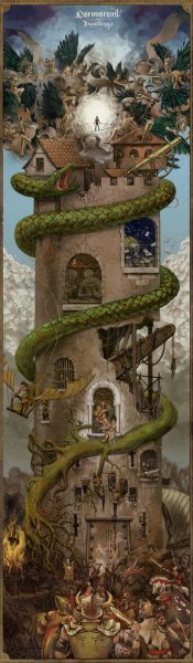
CORMORANT – DWELLINGS
When it comes to ambitiously detailed and beautifully formed artwork the vertical three-panel layout created by Alice Duke for the third Cormorant album – each panel of which could easily serve as an album cover on its own – really does take some beating.
As a matter of fact Dwellings was one of the albums which we pointed to during the planning phase of the artwork for the first Beyond Grace album, as something simultaneously striking and yet well outside the norm.
Of course Cormorant have always had, and continue to have, awesome artwork, but Dwellings still remains the greatest all-round feast for the senses.
https://cormorant.bandcamp.com/album/dwellings
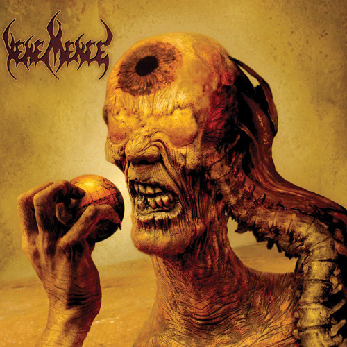
VEHEMENCE – HELPING THE WORLD TO SEE
Wes Benscoter, whose work you can also see on albums by Bloodbath, Cattle Decapitation, Vader… and a host of other (mostly Death Metal) bands… was responsible for this underrated, but still iconic, piece of artistic filth, which holds a particularly special place in my black heart as (if memory serves) Helping the World to See was the first Vehemence album I ever heard.
The sickening details, the mutant weirdness, the careful blending of precise lines and rough-textured colours, all combine into something really special here, while the colour palette he chose to use immediately helps it stand out from the majority of its peers.
Also, the album rules, so check it out if you haven’t already.
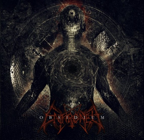
ENTHRONED – OBSIDIUM
And, finally, I really wanted to select something from the world of Black Metal for this list as, although it’s often one of the genres mocked for its…let’s say “questionable”… artistic choices, particularly when it comes to some of the horrendously bad artwork which I’ve seen attached to some otherwise fantastic albums, there are a lot of BM bands to whom the visual aesthetic – the way they present and represent their art – goes hand-in-hand with the musical element.
Thankfully not only is Obsidium by Belgian blasphemers Enthroned one of my favourite Black Metal albums, but the art – produced by the band’s guitarist Neraath – is absolutely to die for too.
Blacker than the blackest black, yet layered with subtlety and nuance all the same, it’s the sort of album cover which reveals more and more of itself to you the longer you look at it.
Of course, you should be very careful when doing so, as know what they say about staring into the abyss, don’t you…?
https://enthroned.bandcamp.com/album/obsidium
******
Trimming this column down to just five entries was, as you might imagine, incredibly difficult. So, before you all head down to the comments section to tell me how wrong I am (or, possibly, before you rush off to pick up your paints and brushes) I’d like to finish off with a quick handful of “honourable mentions”.
DORMANT ORDEAL – WE HAD IT COMING
I loved this one when it came out, and I love it still. In fact I love it so much I even bought the t-shirt. Just a brilliant album with some similarly brilliant artwork by Kuba Sokólski.
https://dormantordeal.bandcamp.com/album/we-had-it-coming
DVNE – ASHERAN
A colourful, progtastic album deserves some similarly colourful and progtastic artwork (courtesy of Eli Quinn). This was one of last year’s best records AND I’d dare say one of its best album covers.
https://songs-of-arrakis.bandcamp.com/album/asheran
BENIGHTED – NECROBREED
Great albums deserve great artwork, and this one delivers on both fronts. Of course the fact that the art was drawn by a friend of mine certainly helps a bit but… what’s wrong with a bit of nepotism?
https://benighted.bandcamp.com/album/necrobreed
PROGENIE TERRESTRE PURA – U.M.A.
The absolutely gorgeous artwork which accompanies this album (not just on the front cover but throughout the booklet) was produced by German artist Alexander Preuss and really is something special.
https://progenieterrestrepura.bandcamp.com/album/u-m-a
WILDERNESSKING – THE DEVIL WITHIN
Some truly incredible work here by Pierre Perichaud, building in an immense amount of depth and detail with a purposefully limited colour palette. Wildernessking have always had great artwork of course, but this one really stands out to me.
https://wildernessking.bandcamp.com/album/the-devil-within
Anyway, now it’s your turn. What album covers have caught your eye recently? What artists can you always rely on to produce something visually-arresting? And what classic pieces have (in your opinion at least) stood the test of time?
Dismember wins it because of the Black Templar Dreadnought.
Some recent album art I love would have to be:
Vampire
Sulphur Aeon
The Lion’s Daughter
Foehammer
Favorite of all time gots to be Cirith Ungol’s King of the Dead
Warhammer and metal is ment to be
Tomb of the Mutilated is the greatest ever.
Ætheria Conscientia – Tales From Hydhradh
Funnily enough my copy of that arrived just yesterday. Love the album and love the artwork.
I never picked that Lesbian cover as the same guy who did Rivers of Nihil, but now that you point it out it’s kind of obvious. I love that UMA cover too, the way it just encompasses the mood of the album.
So many awesome cover artworks out there, but off the top of my head a few standouts for me are:
* Machine Head’s The Blackening. I just love how it’s an actual historical lithograph from the 1600s (http://www.britishmuseum.org/research/collection_online/collection_object_details.aspx?objectId=1648611&partId=1&people=112049&peoA=112049-2-60&page=1). Those folk were into some hellish imagery back then.
* Sepultura: Chaos AD. I think this was my first introduction to Michael Whelan’s artwork, like the Enthroned example above, so many details once you stop and look into it.
* Bedowyn: Blood of the fall. There’s just a great feeling of energy and momentum captured in this one: https://f4.bcbits.com/img/a1148373847_10.jpg
Some of my favourites over the years aren’t necessarily the flashiest but one’s that capture the feel of the album. I love Fear Factory’s Demanufacture for example, so simple but captures elements of the music, the threat of a body being labelled as just a number or code, or even the idea that what the musicians are doing is taking body, bone, flesh and sinew and transforming it into a manufactured product, with the bar code matching the staccato-like mechanistic music. Similarly Obsolete’s album cover – a spinal cord and brain depicted as to look like a sperm, inspires thoughts of mind and idea as the seed that pushes forward the next generation.
Same with Obsequiae’s Aria of Vernal Tombs. It just captures the music within perfectly, or Darkend’s use of Beksinki on The Canticle of Shadows – this rush of a mass of skeletons towards a wall to me is the perfect visual depiction of the feel of the music.
And on a lighter note – Ziltoid the Omniscient: https://en.wikipedia.org/wiki/File:Ziltoidtheomniscientcover.jpg Not only has the mood and feel of some cheesy 60s era sci-fi, but the ridiculousness of such a dweeby looking alien wanting to take over the world is hilarious 🙂 And on that note, I need coffee…
That Lesbian cover is amazing. Would have loved to see Tchornobog (my favorite) and Spectral Lore (III) on this list.