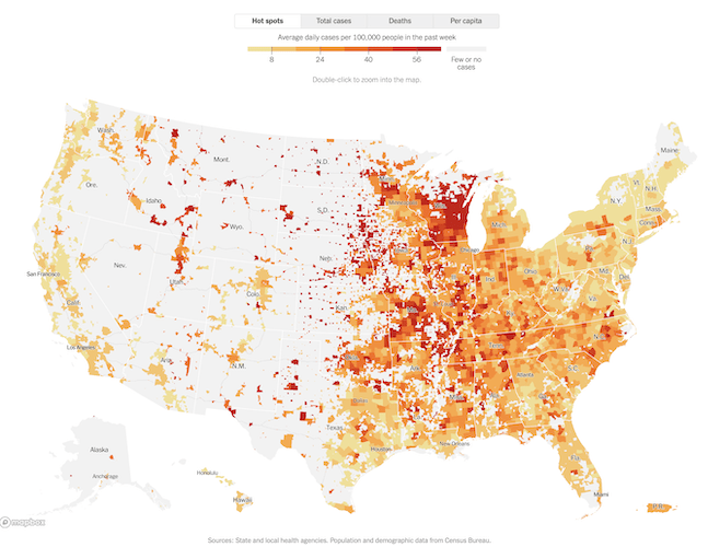
I haven’t done this in a long time, so long that I had to research when the last time was — and it was in May, if you don’t count a post I made in July soon after the Covid death of a man who was an influential mentor and father-figure in my life. But I was stunned to see a map and accompanying data this morning, which made me think it was time again to invite people to share their thoughts about what has been happening to them and their communities during the pandemic. As usual, I’ve included some new metal for people who don’t feel like doing that.
That map I saw is the same one you can see at the top of this post. It was accompanied by this chart:
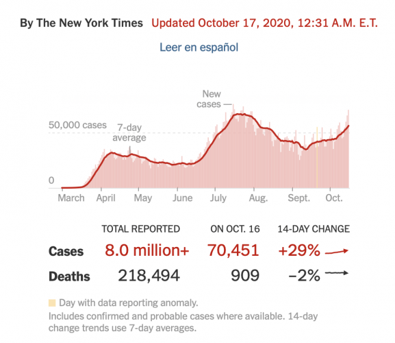
This shows that at least 909 new coronavirus deaths and 70,451 new cases were reported in the United States on October 16th. Over the past week, there have been an average of 56,040 cases per day, an increase of 29 percent from the average two weeks earlier. As of Saturday morning, more than 8,090,500 people in the United States have been infected with the coronavirus and at least 218,400 have died, according to a database maintained by The New York Times, which is where I found this dismal news (here).
That 70,451 number is eye-popping because it’s close to the all-time daily high of 73,523 on July 24th. In other words, here in the U.S. we’re in the vicinity of a new peak that would rival the worst days of the outbreak over the summer. Continue reading »